Magazine Letters Effect Online — Free Ransom Note Style Text Generator
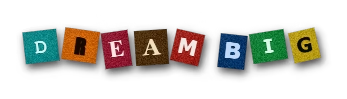
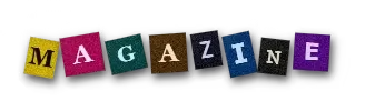
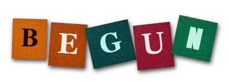
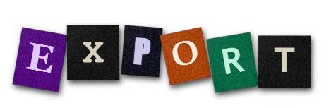
Ransom note typography has a strange pull. Letters cut from different magazines, mismatched fonts, random sizes, odd angles, all assembled into a single line that reads as both chaotic and deliberate. Graphic designers adopted this style from old film tropes and it became one of the most recognizable text styles in social media content. Getting the magazine letters effect online used to mean hours of scanning, cutting, and compositing in Photoshop. PaperAnimators.in does it in under a minute.
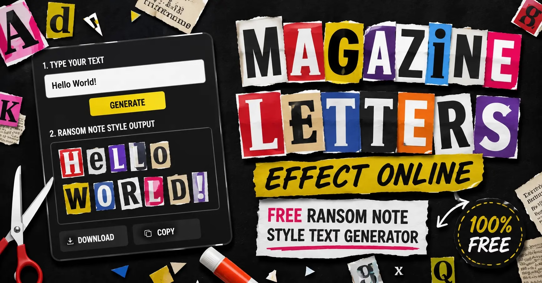
Type your text, click generate, and the tool assembles each letter from a library of real magazine and newspaper clippings. No two exports of the same word look identical. The result is a transparent PNG ready to drop into any design.
Why the Ransom Note Style Works for Content Creators
The ransom note aesthetic signals something specific. It says handmade, unpredictable, and slightly anarchic. In a feed of clean sans-serif text and polished graphics, something that looks physically assembled from cut magazines stops people on pure contrast alone.
Typography researcher Karen Cheng, author of Designing Type, notes that mixed typeface compositions create visual tension that draws the eye before the brain processes the words. That tension is exactly what the ransom note style produces. Viewers notice it before they read it.
The style also pairs naturally with paper cut-out characters from PaperAnimators.in. A paper figure next to magazine letter text creates a visual language where both elements look physically crafted. That combination is hard to replicate quickly with standard design tools and that difficulty is what makes it stand out.
What the Magazine Letters Feature Does
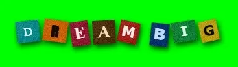
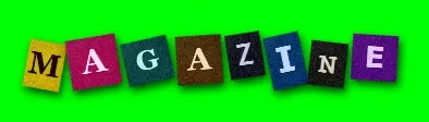
PaperAnimators.in has a Magazine Letters generator built directly into the editing studio. It is a separate feature from the paper cut-out and background removal tools, built specifically for this text style.
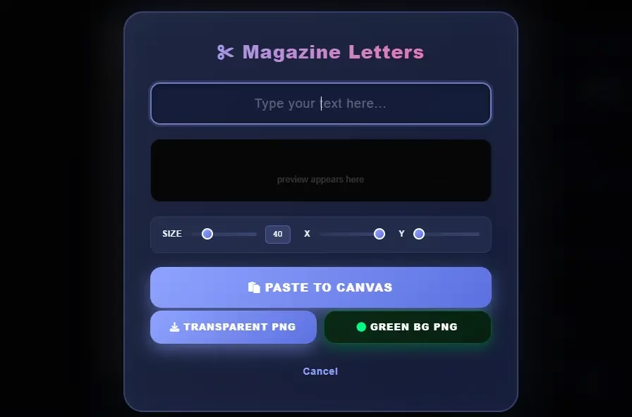
The interface is simple. A text input field, a randomize button, and export options. Each letter comes from a different source in the library with its own font, size variation, and slight rotation. The complexity is entirely in the output.
Short phrases in two to six words work best with this format. Beyond six words the randomized sizing and angles make longer text harder to read quickly on a phone screen.
Step 1: Open the Magazine Letters Feature
Open PaperAnimators.in and go to the Magazine Letters section in the editing studio. You will find it as a separate feature alongside the paper cut-out tools and background removal options.
The text input field sits at the top of the panel. Below it are the generate button, randomize control, and size and spacing adjustments. Everything you need is on one screen without switching between menus.
Creators in Srinagar, Raipur, and Patna use this feature to build thumbnail text for their YouTube channels without paying for Photoshop or hiring a graphic designer. The whole process from opening the tool to downloading the PNG takes under three minutes.
Step 2: Type Your Text and Set It Up Right
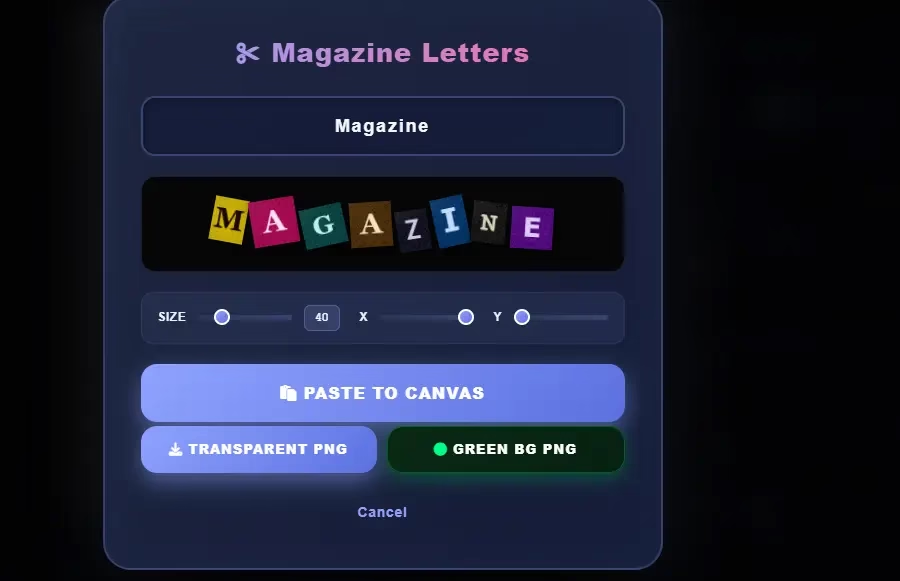
Type the words you want to generate into the input field. A few things make a real difference at this stage.
Keep it short. One to three words works best for YouTube thumbnails. Four to six words is the practical limit for social media graphics. Longer phrases lose readability because each letter sits at a slightly different angle and size.
Use all caps. Lowercase magazine letters look inconsistent in a way that affects readability. Capital letters have more uniform visual weight even when fonts differ, which makes the assembled text easier to scan at a glance.
Check your punctuation before generating. The library covers the full alphabet and numbers. Punctuation availability depends on what exists in the source material. Test your phrase first before committing to a specific phrasing that relies on punctuation marks.
Step 3: Generate and Randomize Your Magazine Letters Effect Online
Click generate and the tool assembles your text from the clipping library. Each letter comes from a different source with its own font, ink quality, and paper texture. The first result is one of many possible arrangements.
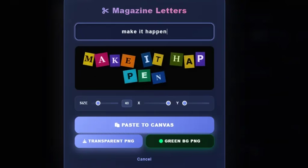
Click Randomize to reshuffle the letter selection. The same letters appear but drawn from different sources each time, producing a visually different arrangement. Two to four randomizations give you enough options to choose from. After five or six shuffles the differences between versions become minor.
Look for an arrangement where the letters have roughly similar visual weight across the phrase. No single letter should be dramatically larger or smaller than the others. Pick the version where the text reads most naturally at a quick glance.
Step 4: Adjust Size and Spacing
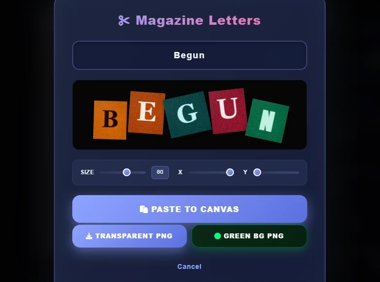
After choosing an arrangement, adjust size and spacing to match your intended use.
For YouTube thumbnails, larger text with tighter spacing reads better at the small sizes thumbnails display in search results. Loose spacing between large letters makes the text feel scattered when compressed to thumbnail scale.
For social media graphics where text fills most of the frame, more spacing between letters gives each clipping room to show its individual texture. The crafted quality of each letter becomes more visible with breathing room around it.
Step 5: Export as Transparent PNG
Export the magazine letter text as a transparent PNG. The background removes entirely, leaving only the letter clippings on a transparent base. Place this on any background colour, photo, or design without a white box appearing behind it.
The transparent PNG works in every design tool. Canva, Photoshop, Adobe Express, PowerPoint, and any video editor that accepts image overlays all handle it without conversion. This makes the magazine letters effect online output from PaperAnimators.in compatible with whatever tool you already use.
One thing to check before downloading. The edge quality of each letter should look clean at 100 percent zoom. If the letters look sharp at full size they hold up at thumbnail scale and on mobile screens.
How to Combine Magazine Letters With a Paper Cut-Out
The most effective use of this feature is pairing magazine letter text with a Paper Animator cut-out character. Both elements share the same visual language and look like they belong together in a way that mixing magazine letters with a standard photo background does not.
Export your paper cut-out as a transparent PNG separately. Export your magazine letter text as a transparent PNG separately. Bring both into Canva and compose them on the same canvas. Place the paper character on one side and the magazine text on the other.
Because both elements have transparent backgrounds they sit cleanly on any background without borders or halos. This two-element composition takes about five minutes to produce and is one of the most distinctive thumbnail styles available right now.
Uses Beyond Social Media
The magazine letters effect online output works across several formats that most creators do not immediately think of.
Podcast cover art in most app libraries looks similar. Clean sans-serif fonts on blurred photos fill most of the space. A magazine letter title on a bold background separates a podcast cover from everything around it immediately. Music journalist and podcast producer Alex Puro notes that cover art with typographic contrast gets more taps in recommendation rows than covers with faces or blurred backgrounds.
Event posters for small gigs, creative workshops, and independent events suit this style because it communicates a DIY and handmade quality. Print on demand products like t-shirts, tote bags, and posters also work well with magazine letter text exported at high resolution. The style translates to physical products because it looks designed to be printed.
Personal branding benefits from this style too. A consistent magazine letter name treatment used across content creates a visual signature that is difficult to copy. The randomized nature means no two exports look identical even when the same word generates twice.
Common Problems and How to Fix Them
The Text Is Hard to Read Against Certain Backgrounds
Magazine letters work best against solid high-contrast backgrounds. Against a busy photo or a gradient with multiple colours the varied fonts and sizes lose readability. Add a simple colour block or slightly transparent rectangle behind the text before placing it in your design.
One Letter Looks Out of Place
Randomization occasionally produces a letter dramatically different in size or style from the others. Click Randomize again. One more shuffle usually resolves the outlier. If the same problem keeps appearing for a specific letter, the library has limited variations for that character. Try rephrasing to use a different letter.
The Exported PNG Looks Smaller Than Expected
Export size ties to the canvas display size in PaperAnimators.in. If the text looks small in the export, zoom in on the text in the editor before exporting or increase the text size before generating. This gives the export more pixel data to work with.
Frequently Asked Questions
Can I Use the Magazine Letter Text in Commercial Projects?
Check the terms of use on PaperAnimators.in for commercial licensing details. The magazine letter library uses source material curated by the tool and the licensing terms for commercial use are in the platform usage policy.
Does the Randomize Button Always Produce Different Results?
Yes, within the limits of the library. Common letters like E, A, T, and S have more source variations than less common letters. For very short words you may see repetition after several randomizations.
Can I Use the Magazine Letter Export in Video?
Yes. Import the transparent PNG into any video editor and it works as a static text overlay. PaperAnimators.in does not currently animate magazine letters themselves but you can add entrance and exit animations to the PNG inside your video editor.
How Is This Different From a Ransom Note Font in Canva?
A ransom note font in Canva uses a single typeface designed to look like cut letters. It is consistent and clean. PaperAnimators.in uses actual scanned magazine clippings with real variation in ink quality, paper texture, and print style. The difference is visible when the two sit side by side.
Can I Generate Numbers as Well as Letters?
Yes. Numbers are included in the library. This works for dates, counts, prices, and any design that needs numerals in the same visual style as the letter text.
About the Author
Abdual Qayyum is a digital designer and content creator based in India. He created PaperAnimators.in to help creators produce distinctive paper animation graphics quickly and without design experience. For questions, visit the Contact page.
PaperAnimators.in is a free online paper animation tool used by creators building content for YouTube, TikTok, and Instagram.