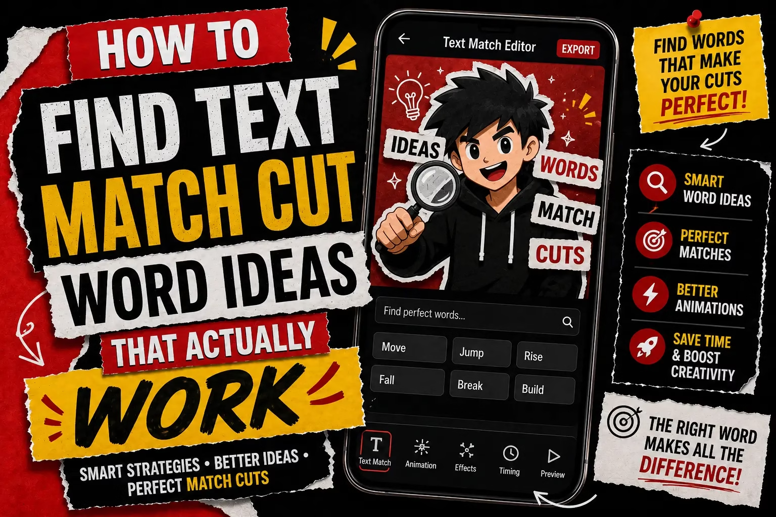
How to Find Text Match Cut Word Ideas That Actually Work
Abdual Qayyum, Content Creator & Digital Designer | Last Updated: June 2026 | Reading Time: 7 min
You have opened the Text Match Cut tool, you can see the two empty boxes waiting for a start word and an end word, and you’re stuck before you’ve even touched a transition style. The tool shows examples like Before→After or Dream→Success, but it doesn’t explain why those work and yours might not. This is where real text match cut word ideas come from, not the tool settings themselves, but understanding what makes two words snap together instead of just filling the boxes.
Where Good Text Match Cut Word Ideas Actually Come From
The examples already on the Text Match Cut page, Before→After, Then→Now, Fear→Freedom, all share one thing: the two words sit in genuine tension with each other. One implies a lack, a problem, a starting point. The other resolves it. That contrast is what the cut is actually selling, the transition style just delivers it on the beat. Two words that don’t oppose each other, like Photo→Picture, technically fill the boxes but there’s nothing for the viewer to feel snap into place, because nothing actually changed.
This is the real difference between a pair that works and one that doesn’t: it’s not about the words being clever, it’s about whether the second word resolves or reverses something the first word set up.
Single Words Beat Phrases Almost Every Time
Every example on the tool page is one word on each side, never a phrase. That’s not a coincidence, it’s a real constraint worth understanding before typing something longer. A single word reads instantly at the size and speed a match cut plays at, especially on a 9:16 export where the text fills a narrow vertical frame. A phrase forces the eye to actually read rather than just register, which fights against the whole point of a cut that’s meant to land on the beat, not be read like a caption.
A small business owner in Jabalpur promoting a weekend sale might be tempted to type “Big Weekend Sale” as the end word instead of just “Sale” or “Today.” The shorter version keeps the punch the effect is built for; the longer phrase turns a snap transition into something closer to a slow reveal, which is not what the style is for.
Matching the Word Pair to the Transition Style
The tool page already explains that Glitch, Shatter, and Particle Burst suit content meant to be noticed, while Fade suits something calmer. The word pair should follow the same logic rather than being picked separately from the style. A sharp, dramatic contrast like Pain→Power reads well with a Glitch or Shatter transition, since the aggressive visual matches the aggressive contrast in meaning. A softer pair like Lost→Found sits more naturally with Fade, where the gentler transition doesn’t fight against a gentler emotional shift.
Picking an intense word pair but pairing it with the softest transition style, or the reverse, tends to feel mismatched even when neither element is wrong on its own. A student in Meerut building a motivational Reel around Struggle→Success would likely get more out of Glitch or Whip Pan than Fade, simply because the words are already carrying that same energy.
Test the Pair Without Sound First
Before deciding a word pair is final, it’s worth previewing it without any thought to what audio or caption might go alongside it later. If the two words alone, with no context, do not communicate something on their own, adding music or a voiceover won’t fix that. The words have to carry the idea by themselves, since a viewer scrolling past will see the text before they process anything else.
A pair that only makes sense with an explanation is not ready yet. Then→Now works without any caption. “Client→Testimonial” doesn’t say anything on its own, even if it made perfect sense inside the person’s head while typing it.
Why a Generic Word Pair Still Works Most of the Time
Everything above is about getting a word pair right, but it’s worth being honest about how much that actually matters in practice. Most people don’t agonize over the words. They type something from a general list, whatever comes to mind, hit generate, and the result still looks intentional, because the word pair is only one part of what’s doing the work. Fifteen transition styles, background color and texture options, and a green screen export all sit underneath whatever two words get typed in, and that range covers for a plain word choice more often than not.
This isn’t a reason to skip thinking about the pair, the sections above still make a real difference for the strongest results, but it’s worth knowing that a decent generic pair paired with the right transition and background rarely looks bad. The tool’s flexibility, not just the words, is what makes it forgiving.
Open the tool with two or three pair options written down first, rather than typing the first idea that comes to mind directly into the box.